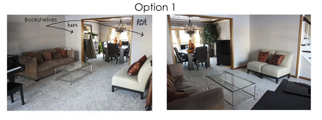
Here is where I started with Option 1. The piano in the front of the room by the window.
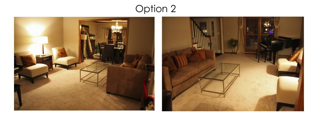
Then I got an "Anonymous" suggestion to flip flop the couch and the chairs - good idea to solve the heavy weight of all that furniture on one side of the room. Thank you Anonymous! Here is option 2.
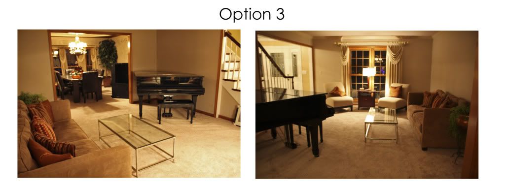
I have been wanting to try another option still, recommended by Nancy (thank you Nancy!), where the piano is on the inside wall. That little wall is odd anyway - it's cut short by the stairs and it doesn't look quite right to put furniture in front of the stair spindles. I like it from the front door, but it looks a bit blocked coming from the dining room.
Ryan keeps angling my chairs, I am more of a straight lines are best kind of person, but I don't know.
Opinions and advice and welcome and appreciated! I WILL work this out. I must say that I have spent more time in that room this week staring at it than I have since we moved in!
Linking to:

Debbiedoos Bloogging and Blabbing Newbie Linky Party


Love option 3 with the piano in the corner by the stairs. To open it up even more, how about the sofa in front of the windows and then the two chairs on either side for a conversation group. Maybe that would make it feel more open from the dining room. Hugs, Marty
ReplyDeleteAnother thought is to turn the piano around with the bench in the corner. Then the angle of the piano opens the space up more. Just a thought. Hugs, Marty
ReplyDeleteLove option 3 and agree with Marty about turning the piano around. Looking good.
ReplyDeleteSarah
Hi! Hmmmm...ok, call me crazy (you probably will!) but what about moving your piano back into the spot in front of the window, then moving the couch to the middle of the room with its back towards the piano....2 chairs across from the couch with their backs towards the dining room...coffee table in the middle. That way you have pulled things away from the walls and created a conversation area and also a little bit of seperation between the piano and your furniture. I always like furniture that seems to be more "floating" in a room and not up against walls. Does any of this makes sense? Your hubby isn't going to like your bloggy friends if they are making him move the piano again! LOL! Thanks so much for linking this up to Inspiration Friday over at the Fence! :-)
ReplyDeleteVanessa
i like option 3 and the chairs angled.
ReplyDeleteI like option 3 as well. To me, the piano looks like it's meant to be by the stairs. Beautiful room! I found you at Debbiedoos!
ReplyDeleteMelanie
www.youmadethat.blogspot.com
Welcome to the party! My first thought was NOT to have the couch against the wall...I like Vanessa's thoughts and that is how I would try it. Also I would have the piano facing the crowd and the music would flow out, not to the wall..thanks for joining the party.
ReplyDeleteDoesn't the piano have to be on an inside wall? I like option 3.
ReplyDeleteI love option three and angled chairs are great!
ReplyDeleteI like option #3 and the way the chairs are angled. Nice work!
ReplyDeleteI'm here from Debbiedoo's Newbie party, am a fellow Newbie and your newest follower. I'm glad to have found your blog.
Have a great day.
Pam
I love the way the chairs are angled. Love that!! I found your blog from Debbie's linky party I am now following along. Come visit me if you get a chance I am a newbie too noplacelikehomeally.blogspot.com
ReplyDelete~Allyson~
WOW! Piano moving is alot of work! Option 3 looks best to me!
ReplyDeleteYep I like Vanessa idea! I am your newest follower
ReplyDeleteI like option three if you decide to move again, I would keep the chairs in the window, it's nice having window seating like that! Popping over from Debbiedoo's party!
ReplyDeleteVisiting from Debbiedoos. I like option 3 best.
ReplyDeleteGlad to know I'm not the only one that requires the furniture to be moved a bazillion times before I am happy with it - I'm totally a visual person!
ReplyDeleteMy unsolicited advice: try it one way for a while, they change it if you find it isn't working. This way you will see what traffic patterns people use, what conversation areas are the best etc.
PS Thanks for the nice comment over on my blog! It is so nice to have feedback :o)
My hubby hates moving our piano too and it isn't even 1/2 as big as yours!! I like option 3, but I also like picket fence's idea about putting the couch in front of the piano (putting all furniture off the walls). I'm going to spend some time puttering around your blog, thanks for having me!
ReplyDeletei love vanessa's idea, too! ditto! show us pics if you try it!
ReplyDeleteI love option #3. I would turn the piano around though. You could decorate the top of the piano with fabric and large urns or something big scale.
ReplyDeleteThe chairs look wonderful in front of the window angled. I am your newest follower too. Stop by and say hello. Linda
I like option 3 and I have to agree with Ryan. The chairs angled looks great.
ReplyDeletei am loving option 3. having those little chairs by the window makes a lot of sense to me, read a book, browse a magazine etc.. love the placement of piano there too. i am a fan of getting ride of straight "race tracks"...lol...i think it comes from years of creating classroom layouts for preschoolers; gotta put up the obstacles.
ReplyDeleteI am hopping around through the newbie hop to welcome everyone to blogging. I love making new bloggy friends and i especially love helping new blogger grow their following.
Stop by my blog when you have a chance. There are so many FUN things happening over on Dandelion Wishes!!!
We are .....
*Taking Back Monday, one Etsy giveaway at a time. Come enter to win something awesome EVERY Monday!
*Airing our dirty little secrets with Friday Confessional. Confess, link up, feel better...I promise!
*Keeping it positive every weekend with My Happy List. What's on YOUR Happy List this week? Post and link up...it’s a party y'all!
*And there are crowning’s happening for Queen for the Day...finally, the royal recognition you deserve.
I like option 2, only because I'm more of a straight-lines kinda girl. I avoid moving furniture w/my husband if at all possible - he's convinced that everything mushed against one wall is more functional. Boys. Glad I found you today via We're on the Fence! -diane
ReplyDeletehttp://www.sweeteuropeandreams.com
Hi there! I love the room! Leave it as it is, but turn the piano around, this way the player will face his/her crowd. And I'm a fan of straight
ReplyDeletelines too. ;)
http://styleidoscope.blogspot.com/
I like Option 3, but I would turn the piano around. My second option would be the one about moving the furniture away from the walls, but again would have to know the traffic flow of house. I am visiting from the Newbie Party and am a follower.
ReplyDeleteMostly I lean towards Opt 3
ReplyDeleteThe only reason Opt 2 keeps kinda speaking to me, is that I like that you'd see the whole piano when you walk into the home, not just part.
Found you via Debbie's! Hi there!
I'm here from Debbie's Newbie Party, & I'm your newest follower. I don't remember who I'm agreeing with, but I think you definitely want the piano in that corner (Opt. 3) but turned. The pianist should always face the audience, plus the sound will be better. Have you though about a small chandy in that corner over the piano (well, over the pianist)? I like the sofa and chairs where they are in Opt. 3, but I wonder if there is adequate space between the coffee table and the piano. It looks kind of tight. You could switch the sofa and 2 chairs which would open up the walkway through that room. I like furniture on angles and floating if possible. The best way to explain the difference in the feeling of a room where all the furniture is flat against walls versus having a few pieces at angles (even slight angles) is this: Think about how you hold your arms when you are getting ready to give someone a hug. They are slightly curved and beckoning that person to step within that area, and that's the feeling you want your rooms to project to your guests. Does that make sense? Anyhoo, that's my opinion & I'm sticking to it. Your poor hubby. I can't wait to see what you decide.
ReplyDeleteCAS